Or a Legacy of Acid Blood:
A review of Aliens Versus Predator: Fire and Stone #1.
By James Kislingbury
 | |
| Exhibit 1: Pay attention. This will come up later. |
Alien Versus Predator wasn't ever good, was it?
If making me ask the tough questions
indicates sharp writing and fine storytelling, then Alien Versus
Predator: Fire and Stone #1 is an excellent standard. If you judge it
by any sort of actual standard, you will discover that this is one of the crappiest things you could throw $3.50 at. I suppose you could just flush it down the toilet, but that doesn't seem very environmentally sound.
If anything AvP #1 should be applauded
for its consistency. The comic begins as it ends: An incoherent jumble
of characters, plot points, and unknown motives, then filled in with lazy art and a dumb concept.
From the very first pages, you know that you're in trouble, because it begins less en
media res than it does directly after another comic book, one that,
notably has not been released yet (The editorial staff at Dark Horse
are happy to point out in synopsis that this takes place between the
Prometheus story and the Predator story, which, again, if Predator is
going to be in the future then why even. . . Ah, never mind).
The story Christopher Sebela has
scrawled into the dirt with his numb hands, rendered as dactyl as
flippers from years of neuro-syphillis (or so I imagine) is shockingly
incoherent, even for a book that contains the word “Versus.”
I could go on and on about the problems
this issue has, from minor to major, but to burn any more calories on
this than I need to would make me look like an even bigger asshole
than I already am. The problematic crux of this book is the villain.
. . Or rather, who I understand the villain to be. And he must be the
villain, he doesn't have any skin. Or, well, a little bit of skin, which is arguably worse than no skin at all.
 |
| Hey! Look! Stuff! |
I don't know who this bad guy is. Not
in the sense of “Who is good? Who is bad? In this crazy, mixed up
world of ours, is there any other shade than grey?” No. I mean it
in the sense of “I do not know who this is supposed to be.” I
know now that he is from the Prometheus comic book, but really, how
is anybody supposed to piece that together? Or much less care? I'm
reading these books and I have no idea what this is supposed to be.
The villain looks like he's dressed up
as an edgy re-imagining of Skeletor that you found on Deviant Art and.
. . Poison Ivy? And he can control aliens? For some reason? As best
as I can tell, the bad guy, whoever the fuck he is, is some kind of a
GWAR. I mean, I like GWAR and it's good to see them get work, but I
don't know if this is the right project for them. Also, I wish for
death.
As far as the art goes, I was actually
looking forward to Ariel Olivetti's return to this weird sub-series.
In 2007 he worked on the book Superman and Batman Versus Alien Versus
Predator which, even as a devout nerd is a bridge too far.
That said, I like him as an artist. He's done fine work in the past
and it's always good to see a book like this, which can sell on its
name alone, featuring a skilled, respectable artist.
I can see now this thinking was
delusional.
As fine as Olivetti might have been in
the past, this comic book (on all levels, to be fair), on every
level, is a lazy, misguided book. So, again, at least the art matches the script.
His panels, in many cases look
unfinished. And, fair enough, maybe that's his style. Cary Nord's art never looks finished and he's great. As you read on, though, a pattern
begins to emerge. You being to see an unfortunate amount of recycled
backgrounds in the book, as well as one of the silliest, most obvious
cut and paste jobs that I've ever seen. If he doesn't particularly
care about the book and its art, why should I?
So, there is a laser gun in this book.
And it is a plot point. Because, of course, in all the universe, in
all of the things and ideas you could stumble upon, from the dawn of
the species to its near extinction, the only thing you can come up
with to intrigue the audience is a gun that shoots slightly better
than the other guns we've already seen. What wonders await us in
issue #2? Maybe a car that goes slightly faster than other cars!
Maybe it uses five wheels!
But you will see this gun over and over
again. I do mean the same gun. Olivetti only seemed to have drawn it
two or three times, the other times, it is poorly photoshopped into a
character's hand. Oh wait, sometimes it's mirrored. And sometimes
it's tilted slightly.
Also, the space ship from the
Prometheus comic book still looks dumb as hell. It looks like a
dumpster with a cyst problem.
 | |
| Admittedly, the color palette in this version is better than the print version. |
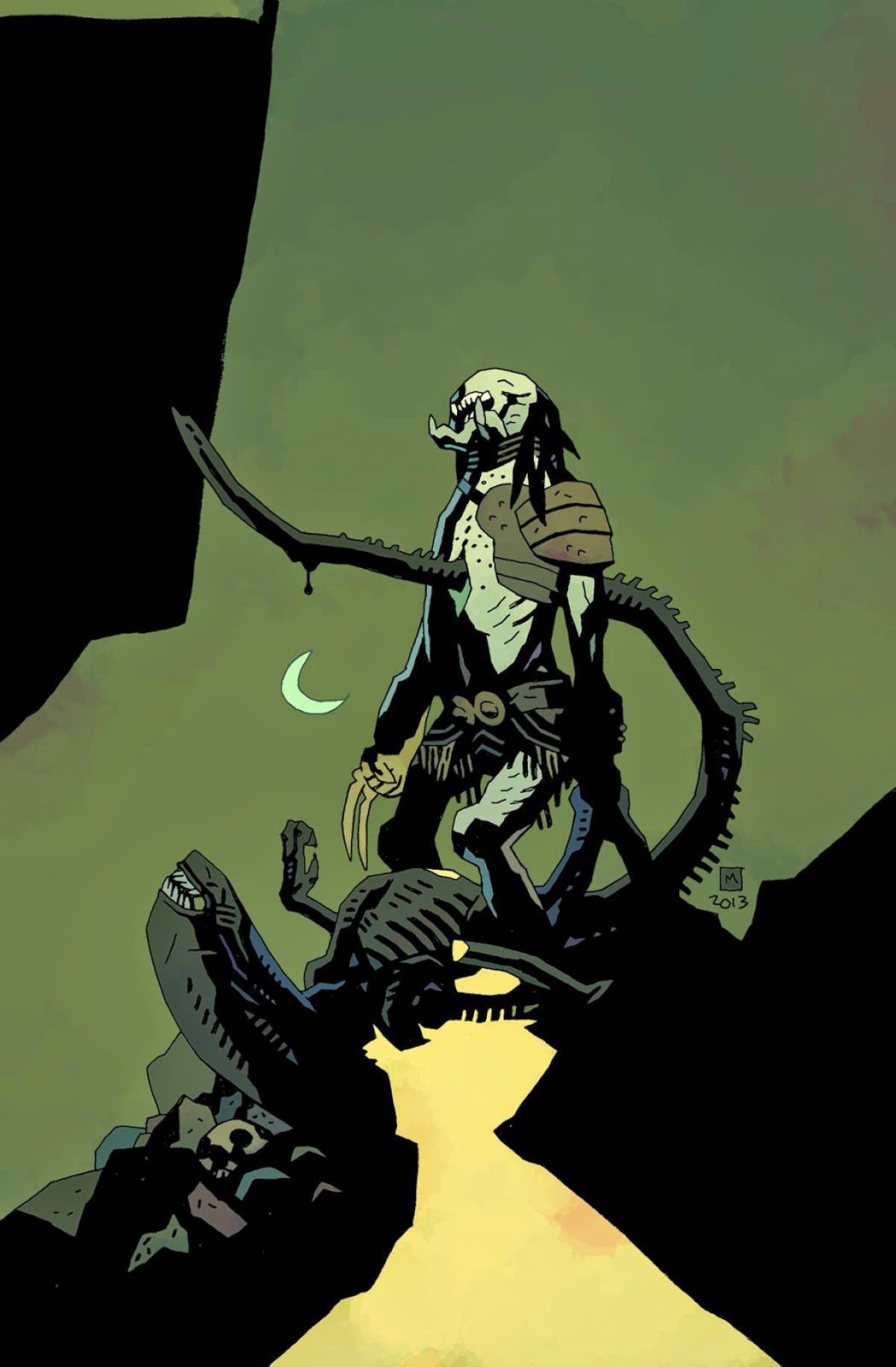
AvP also carries on Prometheus'
tradition of featuring a great artist kind of phoning in a cover. The
cover features another AvP legacy artist: Mike Mignola. Who
originally worked on AvP #0 way back in the late 80's, the inaugural issue of this entire
debacle. In a way he's to blame for all of this. Anyways, it's not a
god cover. It's not good A, v, or P art and it certainly doesn't
belong alongside other Mignola art. Oh well. At least he didn't lose
too much time making this one and he could probably buy a high end juicer with this pay check. And everybody deserves a good juice.
I don't hate this comic. I hate that I
have to read three more issues of it. None of that feels good to say.
I like this universe on the whole and, as I get older, I don't like
to trash things simply because they're bad. Now I try to only trash
things because they are morally objectionable or because of some
terrible political point they're trying to push. But this? It's just
lazy. And that's not enough of a character flaw to justify my anger.
This poor excuse for kindling gets one chestburster out of five. I pray
for the silly chestburster from Space Balls. Give me anything else
but what this is. It is only spared a zero for Olivetti's competent, if fairly unenthusiastic art. Even when he doesn't care, he can still pump out something worth looking at. Almost.
See you next month, you blight, I hope you. . . Oh. Oh, we're going to get a fucking pred-alien, aren't we? Goddamnit what am I even doing here?
SIDE NOTE:
Speaking of logos, the AVP logo puts a sour taste in your mouth, doesn't it? I prefer the original logo, if only because it isn't tainted by those terrible, terrible movies. Goddamn Requiem is a piece of garbage.
You can read part one of Me versus Aliens Versus Predator here.
You can read part one of Me versus Aliens Versus Predator here.
James Kislingbury writes, podcasts, and needs you and is sick and tired of your bullshit.
No comments:
Post a Comment